Lab note #026 Tool-based manipulation

Most desktop, mobile, and web apps use a form-based metaphor to manipulate the state of the digital objects sitting in the database. This is a little odd when you think about it. Most things in the real-world don't work like this, aside from our complex machines.
What would it look like if modern computing environments were tool-based, rather than form-based? By that, I mean if you wanted to manipulate a digital object, you would grab a digital tool and apply it to the digital object.
Certainly, we see this in artistic tools like Figma and Photoshop. I suspect that it's largely because it takes the metaphor from an artist's desktop, where there's many tools to employ. Whereas the desktop metaphor in an office is usually a single tool, like a pen or typewriter. So when we devised modern interfaces, it comes from the lineage of an assumed single tool of a single pointer with a single tool to write.
But I don't think it has to be this way. What might this look like? I explored a little bit of it this past summer, along with a separate, but related question of what computing interfaces would look like if they were embodied–where the user had an avatar.
Inventing interfaces is hard. I didn't realize to the extent that I took current interfaces for granted as being "natural" until I tried inventing my own. There are a lot of little micro-decision you need to make and try.
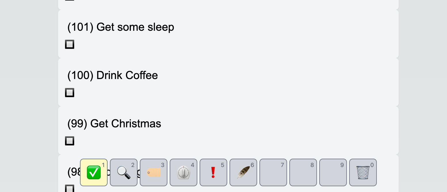
For example, I started with a Minecraft and Stardew Valley interface, with the left hand on WASD for positional navigation of the avatar and the right hand on the mouse for orientation navigation and pointing. Tools would be selected with the number key row hotbar.
However, in this instance, there would be no avatar, so the left hand could be reserved for tool selection. With a todo list application, I had a couple different tools that I found I wanted.

- Checkmark tool: mark a todo list as being done or not
- Magnifying glass tool: look for a particular todo list item in the list
- Tagging tool: group the todo list item as part of a collection for organization
- Timer tool: estimate how long a tool was going to take
- Exclaim tool: set the todo list item as day's priorities
- Feather tool: edit the todo list
- Trash bin tool: delete the todo list
Some of these tools were multi-headed, such as the Timer tool and the Exclaim tool. With the Timer tool, you could set different estimates for how long a task was going to take. With the Exclaim tool, you could set different priorities, and there was only a limited number of priorities you could set for the day.
That's when I realized there was no need for a hotbar with a keyboard because there are tools that are multi-headed tool. A hotbar is only needed because a mouse is by definition single-headed. [1] That's why keyboard hot keys are so attractive. While they do take some memorization, the entire set of tools are available just with a touch.
In addition, in any todo list workflow, you're much more likely to use a tool's different configurations, than to switch between tools. Usually, you're going down a list estimating and prioritizing a todo list, rather than editing, and checking them off.
At the end of this, I realized if I wanted to explore in this direction, it would require a lot of work. Hence, at the end of summer, I found that just using off-the-shelf Automerge wasn't enough to sync relational data. I've dove head first into it since, and resulted in the current trajectory. I would have to think through the potential ROI for this direction given my current goals to really commit to it.


